Visualize This! visualization competition
Announcing winners
2018 Visualize This! Challenge was hosted by WestGrid, a regional partner of Compute Canada. 31 people and groups expressed interest in participating in the competition this year, and we had some interesting submissions. After thoughtful deliberation the jury has picked three winners.
First place
The first place was taken by Philippe Nazair, a Data Visualization Developer at Université du Québec à
Rimouski and part of the MERIDIAN
consortium. Philippe’s visualization is implemented as a static website with two layers: a graph
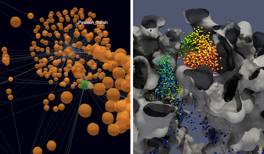
viewer using the 3d-force-graph
web component, and a map viewer implemented with Leaflet to display markers on the map and written biographies from Cambridge’s Orlando author’s page found in the
dataset. Below you can see a screen-capture video showing different interactions on this site. All JSON
files for the visualization were created with a Python backend. We especially appreciated sample graphs
for radical and liberal ideologies and other groups, as well as the ability to build more complex graphs
by selecting a predicate and setting it to a certain value, e.g. hasActiveInvolvementIn = socialism, or
multiple values; each graph is limited to one predicate. Individual graph nodes can be displayed as
either text or draggable spheres.
Or click here to watch this video directly on Vimeo.
Second place
The second prize went to Usman Alim and Roberta Cabral Ramos Mota from the Department of Computer Science at the University of Calgary. Below you can watch one of their visualizations (rendered with OSPRay in ParaView) showing the protein cavity and two “highly-interacting” PO4 beads with the colour representing time step. This work was selected for their skillful use of Python scripting for the bulk of the analysis: using MDAnalysis library for identifying closely interacting membrane beads, and writing bead positions in VTK to be rendered in ParaView. You can download an edited version of their Python analysis script here.
Or click here to watch this video directly on Vimeo.
Third place
The third place was taken by Catherine Winters from the Digital Humanities Innovation Lab at Simon Fraser University. This visualization is powered by D3.js and Three.js, with all JSON data files produced with Python scripting. Not all features of this visualization are complete, so we are not showing it here, but it is likely to remain a side project in the lab over the next few months, with the promise to show clustering based on ideology, religion, or geographic proximity.
Acknowledgments
The top prize for this competition – a 43” 4K Multi-Client Monitor – was generously donated by Dell EMC. We would like to acknowledge Dell EMC for their continued support of Advanced Research Computing in Canada!
Written on December 18th, 2018 by WestGrid