Visualize This! visualization competition
Humanities Dataset Details
This dataset is now available for downloading.
The Orlando British Women’s Writing Dataset (Release 1: Biography and Bibliography) provides a rich set of linked open data representing women’s literary history from the beginnings to the present, concentrated on writing in English in the British Isles but with tentacles out to other languages, literary traditions, and parts of the world. It emerges from the ongoing experiments in literary history being conducted by the Orlando Project, whose textbase is published and regularly updated and augmented as Orlando: Women’s Writing in the British Isles from the Beginnings to the Present by Cambridge University Press since 2006, and from the Canadian Writing Research Collaboratory’s work in Linked Open Data.
The Orlando Textbase is a semi-structured collection of biocritical entries providing detailed information on the lives and writing of more than 1400 writers with accompanying literary, social, and political materials to provide context to its representation of literary history. It does not contain digitized versions of primary texts.
The internal linking of biographical information is using the Canadian Writing Research Collaboratory (CWRC) ontology, with selective linking out to other ontology terms and linked data entities. The dataset makes extensive use of the Web Annotation Data model, the Simple Event Model, and the BIBFRAME ontology.
How to read the data
The dataset contains 3,321,746 triples stored in the Resource Description Framework (RDF) format. RDF is a standard format for storing linked data called graphs.
Learning RDF
You can find a guided reading list on linked data at this page, covering everything from the fundamentals to more advanced topics.
For a quick hands-on introduction to RDF for those without any prior experience, we recommend saving an
example from
this Mozilla tutorial
as an RDF file zoo.rdf and then reading and analyzing it from Python using the
RDFLib library. This RDF results in 13 triples describing the
relationship between objects and their properties.
from rdflib import Graph, RDF, URIRef, RDFS
g = Graph()   # create an empty graph to load data into
result = g.parse("zoo.rdf")   # load the data
print("graph has %s statements" % len(g))   # 13 statements
You can then print all the triples:
for subject, predicate, object in g:
    print(subject, predicate, object)
resulting in the following output (after manual cleanup and reordering):
all-animals is a class for ordered components
all-animals for element 1 has lion
all-animals for element 2 has tarantula
all-animals for element 3 has hippopotamus
lion is named Lion
lion is of species Panthera leo
lion is of class Mammal
tarantula is named Tarantula
tarantula is of species Avicularia avicularia
tarantula is of class Arachnid
hippopotamus is named Hippopotamus
hippopotamus is of species Hippopotamus amphibius
hippopotamus is of class Mammal
These triples completely describe all information stored in the RDF-XML file, in a human-readable form. You can also list all predicates of a given subject
predicates = g.predicates(subject=URIRef('http://www.some-fictitious-zoo.com/mammals/lion'))
for j, p in enumerate(predicates):
    print(j, p)
or print all unique subjects, predicates, objects
subjects = set(g.subjects())
for s in subjects:
    print(s)

predicates = set(g.predicates())
for p in predicates:
    print(p)

objects = set(g.objects())
for o in objects:
    print(o)
and then further filter these data with Python. The 13 triples completely describe all data objects and their connections in the file, so that one could use this information for plotting or reconstructing the original RDF. Note that the source RDF file takes much less space then the resulting triples.
Competition data
The competition dataset contains three files in two formats (RDF-XML and RDF-TTL):
biography(1,081,674 triples) stores most biographical information from the Orlando dataset in the categories listed in the table below, as well as biographical materials that don’t align easily with the specified categories.bibliography(2,240,072 triples) stores standard bibliographic metadata using the Bibframe ontology, including data about works published by the authors whose lives are described in the dataset, plus all works referenced in the Orlando textbase.culturalFormsSubsetis a subset ofbiographyfocused on social identities. We thought it might be useful to have cultural identities in a separate file, if you only want to work with these data.
| Category | Description |
|---|---|
| Birth and Death | Birth and death dates for writers for whom these are known, in some cases including birth order within family and cause of death |
| Cultural identities | Information on the social identities associated with writers, ranging from language, religion, social class, race, colour, or ethnicity to nationality. Such identities shift both historically and at times within writers’ lives |
| Education | Includes links to instructors, schools, subjects of study, and credentials earned |
| Family relations | Information on the family members, including spouses, of writers, and at times information related to their occupations or cultural identities |
| Friends | Information about loose associations through to close and enduring friendships |
| Health | Information on writers’ physical and mental health and illnesses |
| Intimate relationships | Information on both erotic and non-erotic ties |
| Leisure and Society | Information on social activities |
| Occupations | Covers both significant activities of and jobs held by writers |
| Political Affiliation | Information on writers’ political activities including their affiliations with particular groups or organizations and their degrees of involvement |
| Spatial activities | Information on writers’ residences, visits, travels, and migration to particular locations. Spatial data coordinates are granular to the level of settlement only |
| Violence | Information on writers’ experiences of violence on a range of scales |
| Wealth | Information concerning writers’ poverty, income, and wealth |
The files are stored in both RDF-XML and RDF-TTL formats, so you can choose the format you like. In
addition to using separate generators g.subjects(), g.predicates(), g.objects() as outlined above,
you can also list triples that match a given pattern, e.g. a given subject with all possible predicates
and objects:
# list all predicates and objects of a given subject
for s, p, o in g.triples((URIRef("http://cwrc.ca/cwrcdata/Abdy_Maria"), None, None)):
    print(p, o)
The bibliography file bibliography.ttl provides the data using Terse RDF Triple Language (TTL), and you
can read it with RDFLib specifying the format explicitly:
from rdflib import Graph
g = Graph()   # create an empty graph to load data into
result = g.parse("bibliography.ttl", format="ttl")
For the list of variables, their description, and how they interact with each other, it is best to consult the CWRC Ontology Specification and the CWRC preamble. The dataset also adopts some external namespaces, classes, and terms listed here. At the beginning of each RDF file you will find all the external vocabularies that are used in that file, e.g.
$ head Biography/RDF-XML/abdyma.rdf
<?xml version="1.0" encoding="utf-8"?>
<rdf:RDF
  xmlns:dcterms="http://purl.org/dc/terms/"
  xmlns:foaf="http://xmlns.com/foaf/0.1/"
  xmlns:oa="http://www.w3.org/ns/oa#"
  xmlns:org="http://www.w3.org/ns/org#"
  xmlns:cwrc="http://sparql.cwrc.ca/ontologies/cwrc#"
  xmlns:rdfs="http://www.w3.org/2000/01/rdf-schema#"
  xmlns:rdf="http://www.w3.org/1999/02/22-rdf-syntax-ns#"
>
Consulting these sources in relation to the data is key to understanding the dataset.
Research questions
To demonstrate the broad type of information in the dataset, the CWRC ontology provides a number of competency questions. For the purpose of this competition, we suggest some more focused questions that the current dataset is positioned to illuminate:
- What is the relevance of family size to religious affiliation, socioeconomic status, or other factors?
- Does social identity become more diverse over time? Are hybrid cultural forms more common than they were previously? Where are the clusters of hybridity and what are the outliers?
- What do bibliometric visualizations reveal about the publishing networks in the bibliographical data?
- Does the rise and fall of various genres over time within the works of Orlando authors correlate with scholarly accounts of when those genres rose and fell?
- Which authors are the most isolated in the network, and what factors (for instance, social class, place of publication) seem to be associated with being an outlier?
- Can number of publications be related to the number of children a woman writer had?
- Who are the most connected authors in the textbase (most points of contact with other authors) and what are the most common types of connections, in terms of either specific relationships or the contexts in which they occur? Do the types of connections tracked in the dataset modify over time?
- What can a visualization reveal both about the structure of the ontology and the data associated with different components of it? For instance, can it reflect the number and types of instances associated with different components of the ontology, such as by showing the shifting proportions of different Biographical Contexts such as religion, politics, and sexuality as they occur in entries over time?
These questions could be approached by visualizations in a range of formats including charts, network graphs, geospatial maps, heat maps, trend visualization, and infographics.
An example of a chart approach
For the research question “What is the relevance of family size to religious affiliation, socioeconomic status, or other factors?”, produce a series of charts (bar, line, pie charts, etc.) that answer this question. These could be 2D or 3D. Make the process interactive so that the user can select the factors for a multi-dimensional visualization.
An example of a network graph approach
What kinds of biographical networks connect British women writers to each other and to other writers? How extensive are kinship networks as opposed to networks based on political or religious affiliation?
An example of a map approach: Can you map out all the geographic information relevant to a person in Orlando? Can you also map out the person and all the people that they are connected to in Orlando? Does this map information change over time period, with ethnicity, religion, etc.? How do the countries associated with geographical heritage change over time?
An example of a heat map approach
Taking one of the research questions provided above such as “Does social identity become more diverse over time?”, can you represent this as a series of heat maps that plot out social identity (religion, ethnicity, etc.) over time? This could even be in the form of a video such as this one.
An example of trend analysis
The research question “How is the number of publications related to the number of children a woman writer had?” could be illustrated using dynamic graphs, examples of which can be seen in videos of Hans Rosling’s Gapminder visualizations such as this one.
An example of an infographics approach
If you Google Emily Brontë, you will likely come across this infographic:
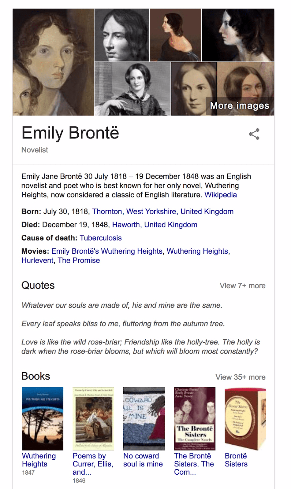
Using the Orlando data, can you produce a more detailed infographic of the author? Can you then expand this to have additional infographics of people who are connected to her and who also appear in the Orlando data? Can you find information in the Orlando data and the ontologies that would produce a much different infographic than Google’s? What would an infographic of a larger group, such as all writers from a particular historical period, or all writers of a given genre of literature, look like?
Sample Visualizations
Genres over time
To demonstrate how information can be extracted from the dataset, here we provide a quick visualization
of genres over time, along with the Python script behind it, using only bibliography.ttl and no
biographical data. In the plot, colour shows the square root of the frequency of a given genre in a given
time bin, with 100 bins covering the years 1600-2018.
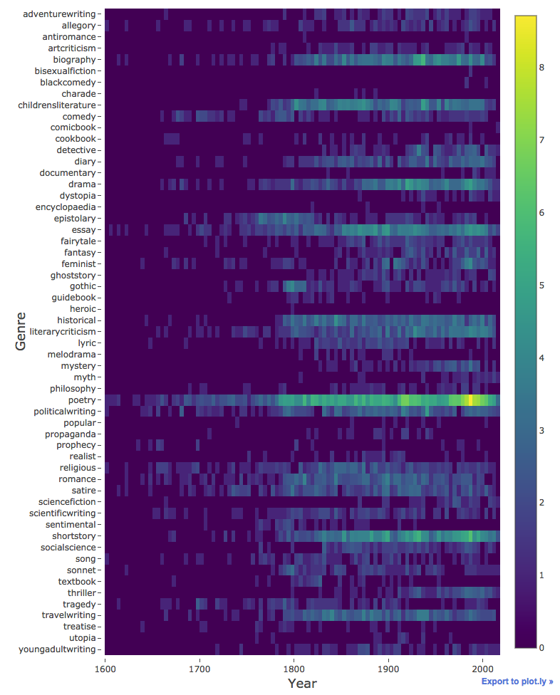
This plot has many shortcomings. For example, it represents absolute and not relative frequency, and it
includes newer editions of older books. One way to correct this latter shortcoming would be to eliminate
any works that were not published during an author’s life. To do this, you will need to use files in
Biography/ folder.
from rdflib import Graph, URIRef
import re
import numpy as np
import plotly.offline as py
import plotly.graph_objs as go

# read the data
g = Graph()
result = g.parse("bibliography.ttl", format="ttl")
print("graph has %s statements." % len(g))   # 2,240,072 triples

# plot only these from 241 topics in the dataset
filteredTopics = ['adventurewriting', 'allegory', 'antiromance', 'artcriticism', 'biography', 'bisexualfiction', 'blackcomedy', 'charade', 'childrensliterature', 'comedy', 'comicbook', 'cookbook', 'detective', 'diary', 'documentary', 'drama', 'dystopia', 'encyclopaedia', 'epistolary', 'essay', 'fairytale', 'fantasy', 'feminist', 'ghoststory', 'gothic', 'guidebook', 'heroic', 'historical', 'literarycriticism', 'lyric', 'melodrama', 'mystery', 'myth', 'philosophy', 'poetry', 'politicalwriting', 'popular', 'propaganda', 'prophecy', 'realist', 'religious', 'romance', 'satire', 'sciencefiction', 'scientificwriting', 'sentimental', 'shortstory', 'socialscience', 'song', 'sonnet', 'textbook', 'thriller', 'tragedy', 'travelwriting', 'treatise', 'utopia', 'youngadultwriting']

books = {}
filteredTopics.reverse()

# in the dictionary, for each book stored as a key, create a value storing the list of its genres
for s, p, o in g.triples((None, URIRef("http://sparql.cwrc.ca/ontologies/genre#hasGenre"), None)):
    subject = s.replace('data:', '')
    object = o.replace('http://sparql.cwrc.ca/ontologies/genre#', '')
    if object in filteredTopics:
        books.setdefault(subject, []).append(object)

# in the same dictionary, add the year of publication to the value list
for s, p, o in g.triples((None, URIRef("http://id.loc.gov/ontologies/bibframe/date"), None)):
    subject = s.replace('data:', '').replace('_activity_statement_0', '').replace('_host_0', '')
    if len(o) == 0:
        date = '9999'
    else:
        match = re.search(r'[12]\d{3}', o)   # covers years 1000-2999
        if match:
            date = match.group(0)
        else:
            date = '9999'
    books.setdefault(subject, []).append(date)

# initialize the frequency array
start, end, nbins = 1600, 2018, 100
ntopics = len(filteredTopics)
frequency = np.zeros((ntopics,nbins),dtype=int)

# compute the frequency of a given genre in a given time bin
for i in books:
    genreCheck, yearCheck = False, False
    year = '9999'
    for j in books[i]:
        if j.isdigit() and j != '9999':
            yearCheck = True
            year = j
        else:
            genreCheck = True
    if genreCheck and yearCheck:   # can use this book
        for j in books[i]:
            if j.isalpha():   # this element is genre
                ibin = int(float(nbins) * (int(year)-start+0.5) / float(end-start+1))
                frequency[filteredTopics.index(j),ibin] += 1

# switch from frequency to its sqrt
frequency = np.sqrt(frequency)

# plot the data
years = [(i+0.5)/float(nbins)*(end-start+1)+start-0.5 for i in range(nbins)]
trace = go.Heatmap(z=frequency, x=years, y=filteredTopics, colorscale='Viridis')
data = [trace]
layout = go.Layout(margin=go.Margin(l=150,r=50,b=50,t=10,pad=4), xaxis=dict(title='Year',titlefont=dict(size=18)), yaxis=dict(title='Genre',titlefont=dict(size=18)))
fig = go.Figure(data=data, layout=layout)
py.plot(fig, filename='genres.html')
Maps of places associated with women writers in Orlando
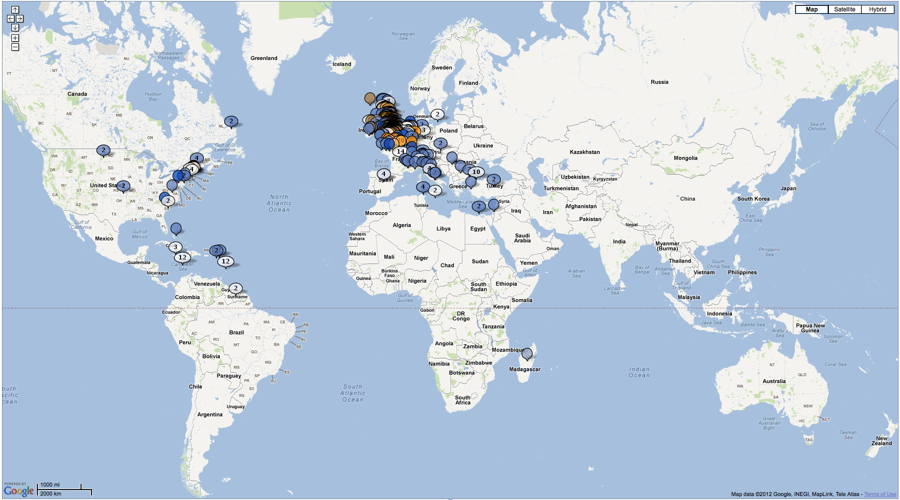
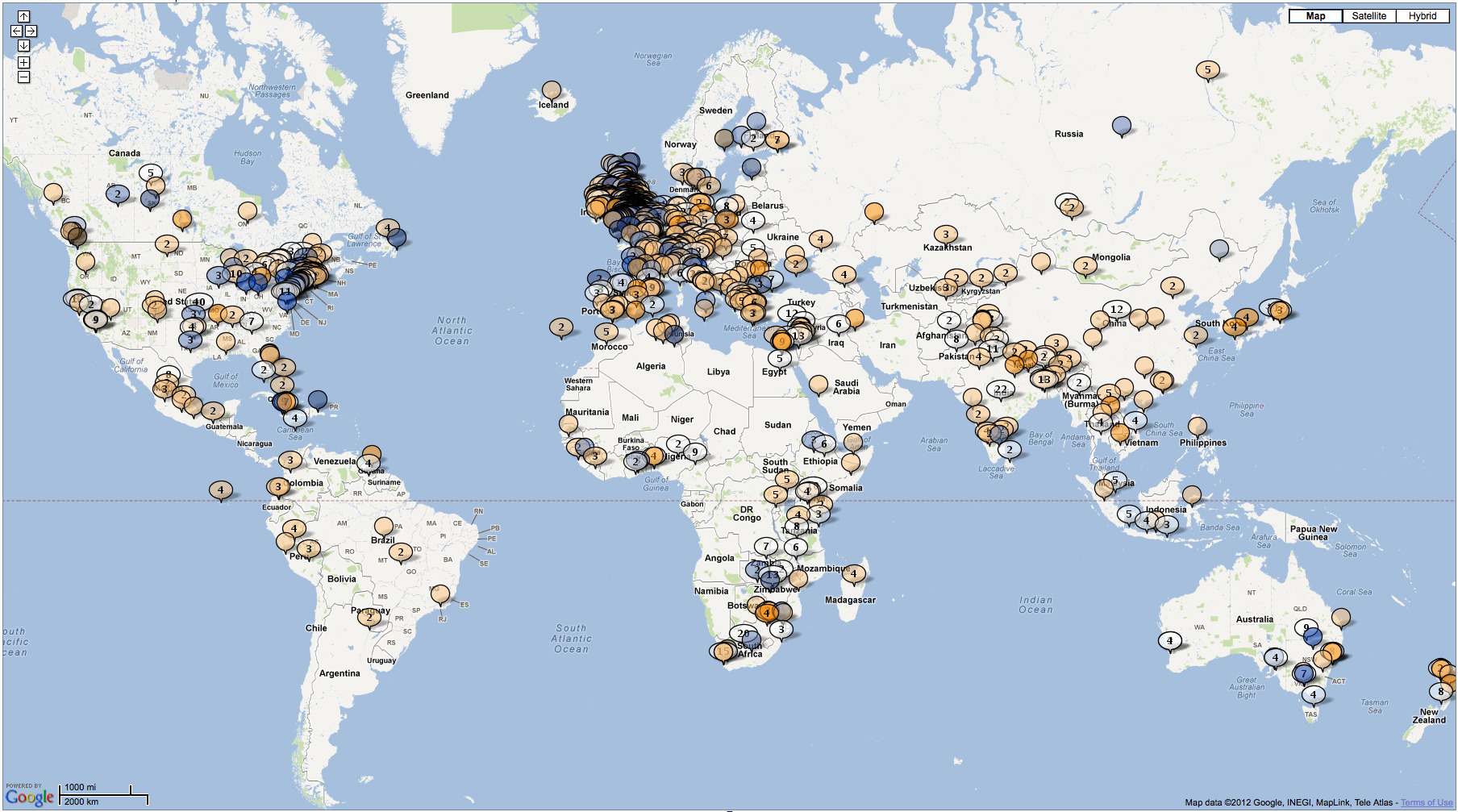
These two geospatial visualizations by a researcher show the contrast between the places associated with women writers born in the 17th century (top) as compared to those born in the 20th century (bottom).
Jewish women writers in Orlando
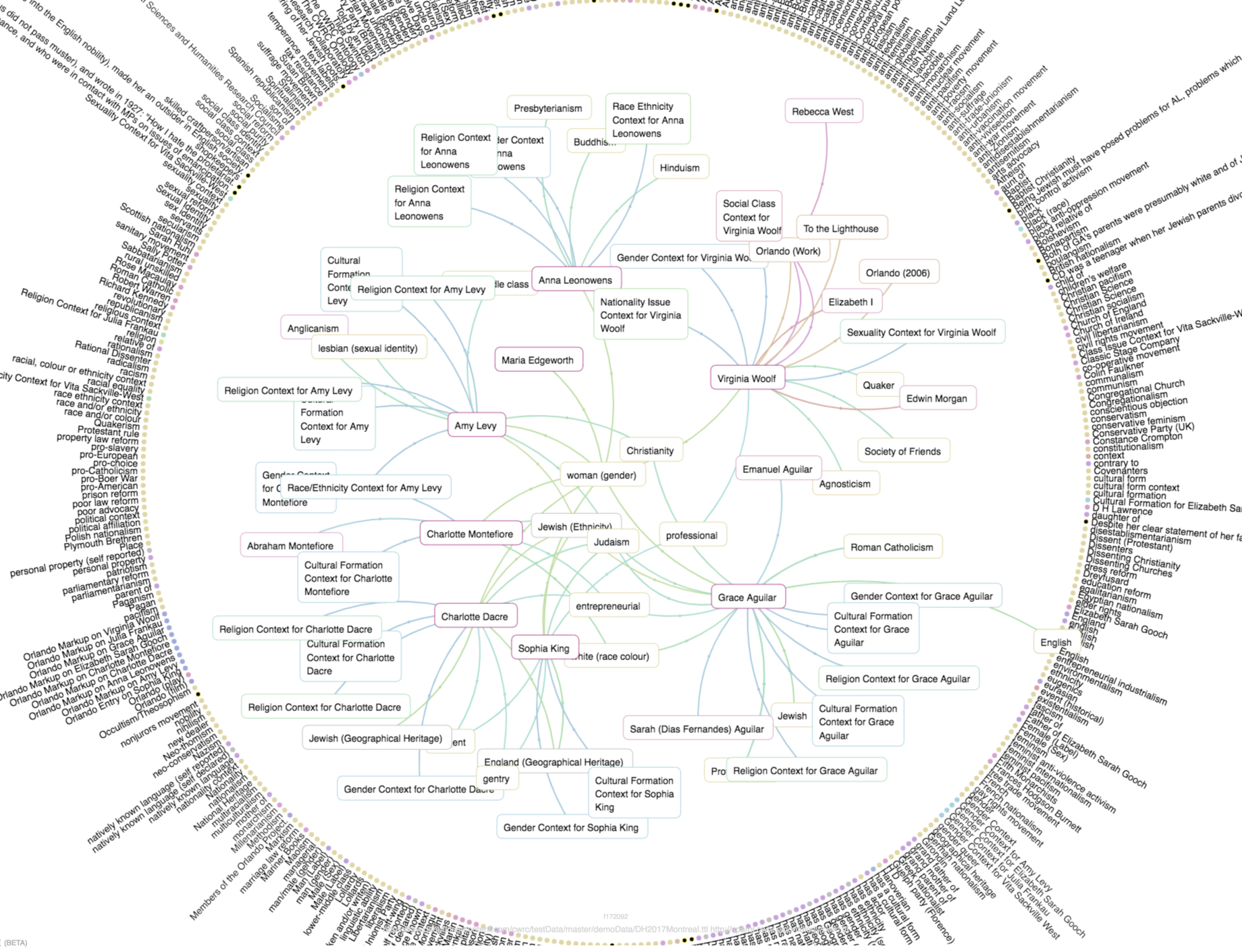
This visualization by a researcher shows the Cultural Forms properties associated with a subset Jewish women writers from the Orlando Project. Each of the pink nodes in the graph is a writer, and the connections between them highlight how they are related: by ethnicity, religion, gender, etc. Click on the image to see the larger version.
Assigning colours to predicates and using them to colour the links probably does not work in this case, as we have too many predicates, but this might give you an idea of the direction you can take.
